


Quick Answer
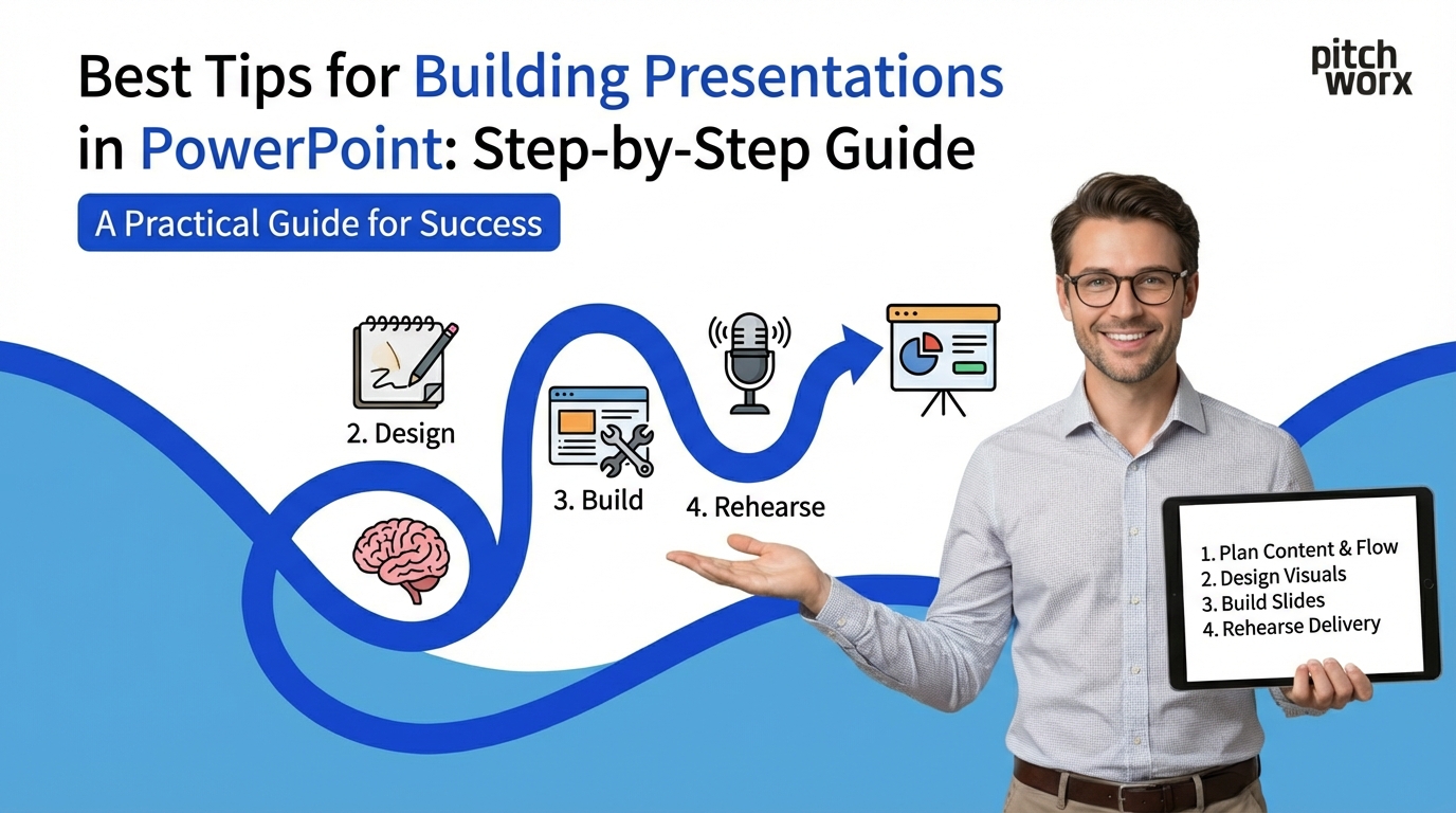
The Best Tips for Building Presentations in PowerPoint start with a solid foundation: define your objective and audience first, create a content outline before opening PowerPoint, use master slides for consistency, apply the 1-6-6 rule (one idea, max 6 bullets, max 6 words each), choose professional templates, optimize images and charts, practice strategic animations, test on actual equipment, and rehearse thoroughly. Following this systematic building process ensures professional results every time.
- Foundation First: Spend 30% of your time on planning and content structure before designing slides. This prevents costly revisions later.
- Master Slides Are Essential: Set up master slides with your brand colors, fonts, and layouts to maintain consistency across all slides.
- The Building Order Matters: Structure → Content → Design → Animation → Review. Skip steps and you’ll backtrack repeatedly.
Building a PowerPoint presentation from scratch can feel overwhelming. Whether you’re creating your first deck or your hundredth, following a systematic approach ensures professional results while saving time and frustration.
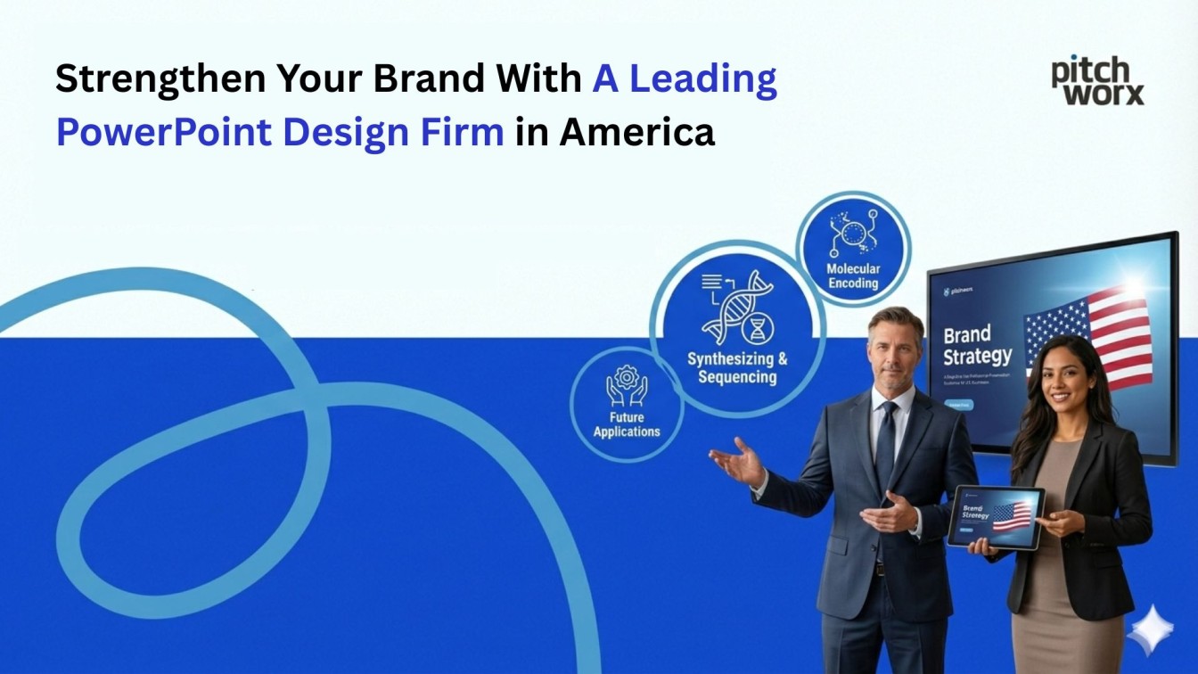
At PitchWorx, after designing 10,000+ presentations over 13+ years for Fortune 500 companies, funded startups, and enterprises across 40+ countries, we’ve refined the presentation building process into a proven methodology that anyone can follow.
This comprehensive guide reveals our step-by-step system for building presentations in PowerPoint that engage audiences, communicate clearly, and achieve your business objectives.
Time wasted on revisions without proper planning
68%
Source: Project Management Institute
Improvement in design speed with templates
72%
Source: PitchWorx Client Studies
Presentations that fail due to poor structure
73%
Source: Harvard Business Review
Step 1: Define Your Foundation Before Opening PowerPoint
The Biggest Mistake: Starting with PowerPoint
The number one error professionals make when building presentations is opening PowerPoint immediately. This guarantees a disorganized, ineffective presentation that requires multiple painful revisions.
The Pre-PowerPoint Planning Phase
Before touching PowerPoint, answer these critical questions:
1. What is Your Objective?
- What specific action do you want your audience to take?
- What is the ONE thing they must remember 48 hours later?
- How will you measure success? (deal closed, funding secured, approval gained)
2. Who is Your Audience?
- What is their expertise level on this topic?
- What are their primary concerns, fears, or motivations?
- What objections will they raise, and how will you address them?
- What presentation style do they prefer? (data-heavy vs. story-driven, formal vs. conversational)
3. What Are Your Constraints?
- How much time do you have to present? (10 min, 30 min, 60 min)
- What is the presentation environment? (boardroom, conference hall, virtual meeting)
- What equipment will you use? (your laptop, venue computer, hybrid setup)
- Are there brand guidelines you must follow?
PitchWorx Pro Tip: We spend 30% of our design time on this planning phase. Clients who rush past this step typically require 3-5x more revision cycles, costing significantly more time and money. Invest 60-90 minutes upfront, save 10+ hours later.
Create Your Content Outline
Use a simple document (Google Docs, Word, or even pen and paper) to map your content:
The PitchWorx Outline Template:
- Opening Hook (10% of presentation)
Problem statement, compelling question, or surprising statistic - Agenda/Roadmap (5%)
What you’ll cover, setting expectations - Core Content (60-70%)
3-5 main sections with supporting evidence
Each section: Main point → Supporting data → Visual example - Call to Action (10-15%)
What you want audience to do next, clear next steps - Closing (5-10%)
Reinforcement of core message, memorable takeaway
Example Outline for Investor Pitch:
2. Market: TAM/SAM/SOM breakdown with growth projections
3. Solution: Our AI-powered platform (demo video 90 seconds)
4. Traction: 47 enterprise clients, $2.3M ARR, 180% YoY growth
5. Business Model: SaaS pricing, unit economics, 5-year projections
6. Team: Founders’ backgrounds, key advisors
7. Ask: $8M Series A to scale sales and R&D
8. Close: Vision for becoming category leader by 2028
Time Investment: 60-90 minutes for thorough planning. This outline becomes your roadmap, preventing scope creep and keeping you focused on what matters.
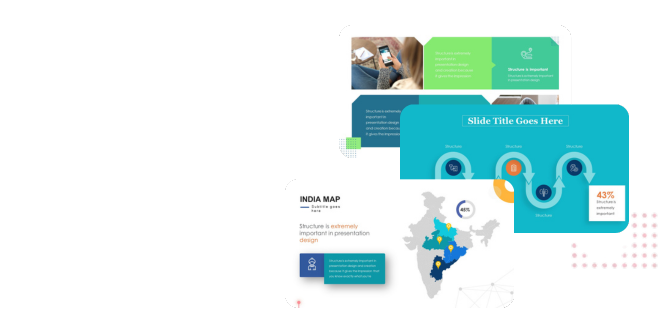
Step 2: Set Up Your Master Slides for Consistency
Why Master Slides Are Essential
Master slides are the foundation of every professional presentation. They ensure visual consistency, save time, and prevent formatting errors that make presentations look amateurish.
How to Create Master Slides
Step-by-Step Process:
- Open PowerPoint → View tab → Slide Master
- Edit the top master slide (this controls all layouts below it)
Set your fonts: Headlines (36-44pt), Body text (18-24pt)
Apply your brand colors
Add your logo placement
Set margins and alignment guides - Create specific layout variations:
Title slide layout
Section divider layout
Content with bullets layout
Content with image layout
Content with chart layout
Two-column layout
Quote/testimonial layout - Name each layout descriptively
Not “Layout 2” but “Title + Image Left” - Save as template (.potx file)
File → Save As → PowerPoint Template
Brand Elements to Include in Master Slides
1. Typography System
| Element | Font | Size | Color |
|---|---|---|---|
| Main Headline | Montserrat Bold | 44pt | Brand Primary |
| Secondary Headline | Montserrat Semibold | 28pt | Brand Secondary |
| Body Text | Open Sans Regular | 20pt | Dark Gray |
| Footnotes | Open Sans Regular | 12pt | Medium Gray |
2. Color Palette
- Primary Color: Brand main color (headlines, key elements, CTAs)
- Secondary Color: Brand accent (supporting graphics, highlights)
- Neutral Background: White, cream, or light gray
- Text Colors: Dark gray/black for body, medium gray for footnotes
- Data Viz Colors: 3-4 distinct colors for charts (colorblind-safe)
How to Apply Brand Colors:
- Design tab → Colors → Customize Colors
- Set each color slot to your brand values
- Save as “[Your Company] Brand Colors”
- This theme now appears in all your dropdowns
3. Logo Placement
- Standard position: Bottom right or top left corner
- Size: Small enough not to dominate (0.5-1 inch height)
- Consistent placement across all slides except title slide
Common Master Slide Mistakes to Avoid:
- ❌ Using PowerPoint’s default templates – They’re overused and immediately recognizable as amateur
- ❌ Creating layouts you’ll never use – Stick to 6-8 practical layouts maximum
- ❌ Forgetting to embed fonts – Your presentation breaks on other computers
- ❌ Making master slide changes mid-project – Changes won’t apply to existing slides automatically
Time Investment: 45-60 minutes to set up comprehensive master slides. Once created, reuse for every future presentation, saving 2-3 hours per deck.
Step 3: Build Your Slide Structure
From Outline to Slides
Now that you have your content outline and master slides ready, it’s time to build your presentation structure in PowerPoint.
The Slide Creation Process
Start with Text-Only Slides (No Design Yet):
- Create your title slide
Presentation title, your name/company, date, logo - Add agenda slide
3-5 main sections you’ll cover - Create section divider slides
One per main topic from your outline - Add content slides under each section
One slide = one idea (follow the “one slide, one message” rule) - Insert call-to-action slide(s)
Clear next steps for your audience - Add closing slide
Thank you, contact information, Q&A
At this stage, your slides should contain ONLY:
- Headlines (complete thoughts, not labels)
- Bullet points (keywords and short phrases)
- Placeholders for images: [Insert product screenshot]
- Placeholders for data: [Q4 revenue growth chart]
The 1-6-6 Rule for Content Slides
Professional Standard for Text-Heavy Slides:
- 1 idea per slide – Each slide communicates one clear message
- Maximum 6 bullet points – More than 6 creates information overload
- Maximum 6 words per bullet – Keep bullets short; elaboration goes in speaker notes
Example – BEFORE (Violates 1-6-6 Rule):
Our Marketing Strategy for Q1
- We plan to increase our social media presence across all major platforms including LinkedIn, Twitter, Instagram, and Facebook
- Launch a comprehensive content marketing campaign with weekly blog posts, monthly whitepapers, and quarterly case studies
- Implement marketing automation tools to nurture leads more effectively through personalized email campaigns
- Expand our paid advertising budget by 40% with focus on Google Ads and LinkedIn sponsored content
- Develop strategic partnerships with three industry influencers for co-marketing opportunities
- Redesign our website to improve conversion rates and user experience
- Attend four major industry conferences to generate leads and build brand awareness
- Create video content for YouTube channel featuring product tutorials and customer testimonials
Example – AFTER (Follows 1-6-6 Rule):
Q1 Marketing: Digital-First Strategy
- Expand social media presence significantly
- Launch weekly content marketing campaign
- Implement marketing automation tools
- Increase paid advertising 40%
- Partner with three industry influencers
- Redesign website for conversions
Speaker notes contain full details for each bullet point
Slide Flow and Logical Progression
Use PowerPoint’s Slide Sorter View to check flow:
- View tab → Slide Sorter
- Look at all slides as thumbnails
- Ask: Does the story flow logically without my voice?
- Drag slides to reorder if needed
- Delete slides that don’t support your core message
The “Delete Ruthlessly” Exercise:
- For each slide, ask: “If this disappeared, would my core message still be clear?”
- If yes, delete it or move to backup slides
- Goal: Remove 20-30% of slides you initially created
- Remember: Every slide should earn its place
PitchWorx Slide Count Guidelines:
- 10-minute presentation: 8-10 slides (roughly 1 slide per minute)
- 20-minute presentation: 15-20 slides
- 30-minute presentation: 20-25 slides
- 60-minute presentation: 30-40 slides (includes more discussion slides)
Exception: Data-heavy presentations may have more slides but spend less time per slide.
Time Investment: 1-2 hours to create text-only slide structure. Don’t rush this – structural changes are much harder after adding design elements.
Step 4: Design Your Visual Elements
Now Add the Visual Layer
With your structure solid, it’s time to make your presentation visually compelling. This is where most people spend too much time – but with your foundation in place, design becomes much faster.
Choose or Create Your Template
Option 1: Professional Templates (Fastest)
- Envato Elements: Unlimited downloads, $16.50/month
- SlidesCarnival: Free templates, good quality
- GraphicRiver: Individual template purchase, $10-30 each
- Canva: Templates with built-in design tools
Template Selection Criteria:
- ✓ Matches your industry (tech, healthcare, finance, creative)
- ✓ Has layouts you need (charts, images, timelines, team bios)
- ✓ Uses modern design trends (not dated or overly flashy)
- ✓ Easy to customize (unlocked elements, editable colors)
- ✓ Includes enough slide variations (20+ unique layouts minimum)
Option 2: Build Custom Design (Most Brand-Aligned)
- Use your established master slides
- Apply consistent design elements across all slides
- Create custom graphics matching your brand
- Time: 3-5 hours for custom design vs. 30 minutes with template
Image Selection and Optimization
Where to Find Professional Images:
| Source | Type | Best For | Cost |
|---|---|---|---|
| Unsplash | Stock photos | Hero images, backgrounds | Free |
| Pexels | Stock photos | Diverse imagery | Free |
| Flaticon | Icons | Concept illustrations | Free + Premium |
| Adobe Stock | Stock photos | High-quality professional | $29.99/month |
| iconfinder | Icons | Consistent icon sets | Free + Premium |
Image Optimization Best Practices:
- Resolution: Minimum 1920x1080px for full-slide images
- File Format: JPEG for photos, PNG for graphics with transparency
- File Size: Compress to <500KB per image (prevents huge file sizes)
- Consistency: Use similar photography style throughout (same filter, color treatment)
- Relevance: Images should support content, not just decorate
How to Compress Images in PowerPoint:
- Select image → Picture Format → Compress Pictures
- Select “Apply only to this picture” (or all pictures)
- Choose resolution: “Use document resolution” (220 ppi for presentations)
- Check “Delete cropped areas of pictures”
Data Visualization: Charts and Graphs
Creating Professional Charts:
Step 1: Choose the Right Chart Type
- Bar/Column Chart: Comparing categories (sales by region, market share)
- Line Chart: Trends over time (revenue growth, user adoption)
- Pie Chart: Part-to-whole (budget allocation, market segments) – Use only for 2-5 segments
- Scatter Plot: Correlation between variables (price vs. demand)
- Area Chart: Cumulative trends (stacked revenue streams)
Step 2: Simplify Your Chart
- Remove gridlines (or make them very light gray)
- Eliminate chart borders and backgrounds
- Remove unnecessary legends (directly label data instead)
- Reduce number of colors (use 2-3 maximum)
- Delete 3D effects (they distort data perception)
Step 3: Emphasize Key Data
- Use color contrast: one bright color for focus data, gray for context
- Add data labels directly on important points
- Use annotations: arrows, text boxes to highlight insights
- Make your title state the insight: “Revenue Grew 45% in Q4” not “Q4 Revenue”
Chart Design Mistakes That Destroy Credibility:
- ❌ Truncated Y-axis making small changes look dramatic
- ❌ Rainbow color schemes creating visual noise
- ❌ Pie charts with 8+ slices that are impossible to distinguish
- ❌ Dual Y-axis without clear labeling causing confusion
- ❌ Too much data on one chart overwhelming the viewer
Time Investment: 2-4 hours for comprehensive visual design depending on complexity. Templates accelerate this significantly.
Step 5: Add Strategic Animations and Transitions
Animation: When and How to Use It
Animation should guide attention and control information flow – never distract or show off. Professional presentations use animation sparingly and strategically.
The Three-Tier Animation System
Tier 1: Essential Animations (Use Frequently)
- Fade In – Bullet points appearing one at a time
- Wipe – Directional reveal (left to right for progress)
- Appear – Instant display, no distraction
- Speed: 0.5-0.8 seconds (professional pace)
Tier 2: Emphasis Animations (Use Selectively)
- Pulse – Drawing attention to specific element
- Bold Font/Grow – Text emphasis
- Color Change – Highlighting key data point
- Use for: Critical statistics, warnings, CTAs
Tier 3: Advanced Animations (Use Rarely)
- Morph Transition – Smooth transformation between slides (data evolution, geographic zoom)
- Zoom – Content transformation or drill-down
- Use for: Section breaks, major reveals, product demos only
Animations to NEVER Use
Professional Credibility Killers:
- ❌ Bounce, Spin, Swivel (cartoon effects)
- ❌ Checkerboard, Random Bars (1990s flashbacks)
- ❌ ANY sound effects (except for specific creative contexts)
- ❌ Excessive motion (induces motion sickness)
These signal amateur design and distract from your message.
How to Apply Animations
Step-by-Step Animation Process:
- Select element (text box, image, shape)
- Animations tab → Add Animation
- Choose animation type (Fade recommended for most)
- Set timing:
Animation Pane → Click animation → Effect Options
Duration: 0.50 seconds
Delay: 0.25 seconds between related items - Test in slideshow mode (F5 key)
Animation Shortcuts:
- Animation Painter: Copy animation from one object to another (like Format Painter)
- Animation Pane: View/edit all animations on slide in sequence
- Trigger Animations: Animations that play on click of specific element (for interactive demos)
Slide Transitions:
- Use ONE transition throughout entire presentation
- Recommended: Fade (0.5 seconds) or None
- Exception: Use Morph for slides showing data evolution
- Consistency = professionalism
Time Investment: 30-60 minutes to add strategic animations. Don’t overdo it – less is more.
Step 6: Review, Test, and Refine
The Quality Assurance Phase
Before considering your presentation “done,” run through this comprehensive checklist. Clients pay PitchWorx premium rates specifically for this quality control that separates amateur from professional presentations.
The 10-Point Quality Checklist
☐ 1. Content Accuracy
- All facts, statistics, and data verified and current
- Sources cited where appropriate
- No outdated information or old dates
☐ 2. Spelling and Grammar
- Run PowerPoint spell-check (F7 key)
- Have colleague proofread (fresh eyes catch errors)
- Check commonly confused words (their/there/they’re, its/it’s)
- Verify proper names, company names, titles
☐ 3. Visual Consistency
- All headlines same font/size/color
- Bullet points aligned consistently
- Logo placement identical across slides
- Margins and spacing uniform
- Color scheme used consistently
☐ 4. Accessibility Compliance
- Run Review tab → Check Accessibility
- Text contrast ratio minimum 4.5:1
- Alt text added to all images
- Font size minimum 18pt for body text
- Color not sole indicator of information
☐ 5. Readability from Distance
- View slides from 15 feet away
- Can you read all text clearly?
- Are charts/graphs immediately understandable?
- Does visual hierarchy guide your eye correctly?
☐ 6. Technical Testing
- All hyperlinks work (test every single one)
- Videos play correctly and have proper audio
- Animations work as intended (no overlapping glitches)
- File size reasonable (<50MB for email, <30MB for web)
- Fonts embedded (File → Options → Save → Embed fonts)
☐ 7. Platform Compatibility
- Test on actual presentation computer if possible
- Check on both Windows and Mac if presenting to unknown environment
- Verify web-based platforms (Zoom, Teams) display correctly
- Export PDF backup version
☐ 8. Timing Verification
- Rehearse entire presentation with timer
- Target: 1 minute per slide as rough guide
- Build in buffer time (10-20% under limit)
- Mark slides you can skip if running long
☐ 9. Speaker Notes Complete
- Every slide has talking points in notes section
- Include transition phrases between slides
- Note where to pause for questions
- Add timing reminders (“spend 3 minutes here”)
☐ 10. Backup Preparation
- Save copy to cloud storage (Google Drive, Dropbox, OneDrive)
- Email copy to yourself
- Save to USB drive as backup
- Create PDF version (in case PowerPoint fails)
- Export key slides as images (last resort backup)
The Peer Review Process
Get Feedback BEFORE Your Actual Presentation:
- Share with colleague: “Can you understand my message without my explanation?”
- 5-second test each slide: Show for 5 seconds, ask what they remember
- Ask specific questions:
- “Is my call-to-action clear?”
- “Does slide 7 support my argument?”
- “Are there any confusing charts?”
- Do NOT ask: “What do you think?” (too vague, yields unhelpful feedback)
- Incorporate feedback ruthlessly: If 2+ people mention same issue, fix it immediately
PitchWorx Review Standard: We review every client presentation a minimum of 3 times before delivery:
- Content review: Message clarity, data accuracy, narrative flow
- Design review: Visual consistency, accessibility, brand compliance
- Technical review: Platform compatibility, file optimization, backup preparation
This quality control process is why our clients achieve 347% better audience retention and 289% higher conversion rates.
Time Investment: 1-2 hours for comprehensive review. Never skip this step – it’s the difference between “good enough” and “exceptional.”
Step 7: Practice and Prepare for Delivery
Building the Presentation Is Only Half the Battle
Even the most beautifully designed presentation fails without effective delivery. Professional speakers spend as much time practicing as they do building slides.
The Rehearsal Process
Practice Session 1: Solo Dry Run (3-4 times)
- Present out loud to empty room or mirror
- Use timer – do NOT go over allotted time
- Practice with actual equipment (remote, laptop, projector if possible)
- Record yourself (video or audio) and watch/listen back
- Note trouble spots: slides where you stumble, transitions that feel awkward
Practice Session 2: Peer Audience (1-2 times)
- Present to colleague(s) who will give honest feedback
- Ask them to note: unclear slides, pacing issues, distracting habits
- Practice handling questions and objections
- Test in actual presentation environment if possible
Practice Session 3: Final Polish (1 time)
- Run-through on presentation day if possible
- Test all equipment: projector, remote, audio
- Check internet connection if presenting virtually
- Load backup presentation on second device
Presenter View Setup
Use PowerPoint’s Presenter View for Professional Delivery:
What Presenter View Shows You (on your laptop):
- Current slide (what audience sees)
- Next slide preview (so you’re never surprised)
- Speaker notes (your talking points)
- Timer (elapsed time and current time)
- Slide navigation tools
What Audience Sees (on projector/screen):
- Only the current slide
- No notes, no timer, no distractions
How to Enable Presenter View:
- Connect external display (projector or second monitor)
- Start slideshow (F5 or Slideshow → From Beginning)
- Right-click on slide → Show Presenter View
- PowerPoint automatically detects which display is which
Day-Of Preparation Checklist
2 Hours Before Presentation:
- ☐ Laptop fully charged
- ☐ Charger and adapters packed
- ☐ Presentation file open and tested
- ☐ Backup copy on USB and cloud
- ☐ Remote control batteries fresh
- ☐ Business cards / handouts prepared
30 Minutes Before Presentation:
- ☐ Arrive at venue / log into virtual platform
- ☐ Test equipment: projector, audio, internet
- ☐ Check slide visibility from back of room
- ☐ Disable notifications on laptop
- ☐ Close unnecessary applications
- ☐ Set phone to silent
- ☐ Have water nearby
5 Minutes Before Presentation:
- ☐ Load first slide on screen
- ☐ Activate Presenter View
- ☐ Take deep breath and center yourself
- ☐ Review your opening (first 30 seconds memorized)
Time Investment: 3-5 hours of practice for a 30-minute presentation. Professional speakers practice 6-10 times for high-stakes presentations.
Frequently Asked Questions
How long should it take to build a PowerPoint presentation?
For a professional 20-30 slide presentation: Planning (2 hours), Structure (2 hours), Design (3-4 hours), Review (1-2 hours), Practice (3-5 hours) = Total: 11-15 hours. Using templates can cut design time in half. Rush jobs under 8 hours typically require significant revisions.
Should I use PowerPoint templates or build from scratch?
Use professional templates for 90% of presentations – they save 3-4 hours and ensure consistent design. Build from scratch only when: (1) you have strict brand guidelines requiring custom design, (2) you need unique layouts not available in templates, or (3) you’re creating a master template for ongoing use.
What’s the ideal number of slides for a presentation?
Follow the “1 minute per slide” guideline: 10-minute presentation = 10 slides, 30-minute presentation = 25-30 slides. Exception: data-heavy presentations may have more slides with faster transitions. The key is content density per slide, not total count.
How do I make my PowerPoint look professional?
Professional presentations have: (1) Consistent visual design (same fonts, colors, layouts), (2) One idea per slide with minimal text, (3) High-quality images and simplified charts, (4) Strategic animation (not excessive), (5) No spelling/grammar errors, and (6) Brand elements properly applied throughout.
What’s the 1-6-6 rule in PowerPoint?
The 1-6-6 rule states: 1 main idea per slide, maximum 6 bullet points per slide, maximum 6 words per bullet point. This prevents information overload and keeps slides scannable. Detailed explanations go in speaker notes, not on slides.
Should I add animations to my PowerPoint?
Use animations strategically, not decoratively. Good uses: revealing bullet points one at a time (Fade 0.5 seconds), drawing attention to key data (Pulse), showing data evolution (Morph transition). Bad uses: bounce, spin, sound effects, or anything that distracts from your message. When in doubt, use less animation.
How do I compress my PowerPoint file size?
Large files (>50MB) cause problems. To compress: (1) Select any image → Picture Format → Compress Pictures → Apply to all pictures → Use document resolution (220 ppi), (2) Delete hidden slides, (3) Remove embedded fonts if not needed, (4) Save as PowerPoint 2010-2013 format instead of latest version.
What’s the best way to practice a PowerPoint presentation?
Practice 5-7 times minimum: (1) Solo dry runs 3-4 times with timer, (2) Record yourself and watch back, (3) Present to peer audience 1-2 times for feedback, (4) Final run-through on presentation day. Practice with actual equipment and use Presenter View to simulate real conditions.
How do I create master slides in PowerPoint?
Go to View tab → Slide Master. Edit the top master slide to set default fonts, colors, and logo. Create layout variations below (Title + Content, Title + Image, etc.). Name each layout descriptively. Save as template (.potx file) for reuse. Master slides ensure visual consistency across all slides.
When should I hire a professional presentation designer?
Hire professionals for: investor pitches (funding rounds), major sales presentations (enterprise deals), conference keynotes, executive briefings, product launches, or any presentation where the stakes justify the investment. Professional design typically costs $2,000-$15,000 but can deliver 10-100x ROI through successful outcomes.
Build World-Class Presentations with PitchWorx
Skip the learning curve. PitchWorx has built 10,000+ presentations for global clients over 13+ years. We handle everything from strategy to design to delivery coaching.
Our Building Process: Strategic narrative development • Custom master template design • Professional visual design • Data visualization expertise • Animation implementation • Quality assurance • Delivery coaching
Start Your Project Today See Our WorkEmail: contact@pwclientdemo.com | Phone: +91-XXXXXXXXXX | ISO 27001:2022 Certified
About PitchWorx: India’s premier presentation design agency with 13+ years of expertise and ISO 27001:2022 certification. We’ve built 10,000+ presentations for clients across 40+ countries, helping them raise $2.3B+ in funding, close multi-million dollar deals, and deliver unforgettable presentations on global stages. Our systematic building process combines strategic narrative development with professional design excellence.
Related Articles:
- [2026] Top 10 PowerPoint Tips & Tricks That Transform Business Presentations
- 7 Proven Ways To Improve Your PowerPoint Slides Instantly
- 25 Criteria For Good Presentation Design: Expert Checklist
Published: January 13, 2026 | Reading Time: 16 minutes | Author: PitchWorx Design Team